Written by
on

I have yet to meet the marketing or web team that doesn’t love dashboards. There is a dashboard for every situation, from organic search performance to “Page not found” 404 errors. We’ve created dashboards for executives and internal stakeholders, and along the way, we’ve seen it all—single-page masterpieces to 40-page behemoths that quite literally take the “dash” out of “dashboard.”
The most common characteristic among this diverse group of data dashboards? After a month or two, hardly anyone is still using them.
After a while, dashboards seem to fall into the role of an insurance policy—providing coverage when a stakeholder asks a question that requires a data-driven response. Beyond those instances, many dashboards are all but forgotten.
We set out to learn why dashboards are enthusiastically embraced up front but fall out of use after a very short time. While we heard of a variety of reasons users abandon their boards, the responses tend to fall into three general categories:
- Access Without Education
- Lack of Alignment
- Confusing Design and Lack of Context
Access Without Education
Far and away the most common reason dashboards are abandoned is that the user doesn’t know how to apply the information the dashboard provides. The best description of working with a dashboard begins with having access to the data, understanding what it means, and then applying that knowledge to generate action. However, it’s the last step—acting on the data—that trips up most dashboard users.
Acting on data doesn’t always mean that the dashboard user directly makes changes in website content or in an ad campaign. Sometimes acting means informing the appropriate team that you’ve noticed something unusual. Other times it means taking a deeper dive into the Analytics platform to fully understand the indicators reported in the dashboard.
Training dashboard users on how to act on dashboards vary with each role and organization. We suggest a two-part approach when introducing new dashboards, which is often accomplished with two meetings:
- The first meeting introduces the dashboard and the problem or opportunity it is meant to address. Users are given access to the dashboard and are expected to explore it before the second meeting.
- At the second meeting we outline responsibilities, discuss the actions to take, and clarify how to escalate findings.
Lack of Alignment
There is nothing that sucks the usefulness out of a dashboard more than a lot of irrelevant charts and graphs. Many dashboards are abandoned because they don’t focus on the user’s needs—instead, the user is expected to weed through the clutter to find the insight they want.
The most straightforward solution is to have dashboards created that are specific to each role. Create a dashboard for the digital marketers that is different than the one made for the web IT team. Content writers will have different data needs than the C-Suite.
Role-specific dashboards aren’t intended to create silos. The only purpose of a dashboard for each role is to put that team member’s relevant data front and center, to provide focus on the actions they can take in their role.
Role-specific dashboards should be shared across roles too. A digital marketer would be very interested to learn the performance of their landing pages when compared to other pages on the site and they might get that information from the IT dashboard. Content writers want to make sure they use words and phrases that resonate with the target audience. Looking into the search term report in the Digital Marketing dashboard gives them that insight.
We recommend creating dashboards for each role on the team and then sharing all dashboards across the team.
Related Reading: Analytics Storytelling: What Has Your Website Done for You Lately?
Confusing Design and Lack of Context
Examples of confusing dashboard design are everywhere and are often caused by the method used to visualize the data. For example, Google’s dashboard platform Looker Studio offers five ways to create a bar chart and nine types of line charts. Beyond how data is formatted into a chart or graph, there is also the layout and structure of the dashboard itself.
The greatest point of confusion comes from “data bloat.” We often see the same piece of data represented in a pie chart, a scorecard, and a line chart all referencing the same time period. To these duplications of information add in the irrelevant charts and graphs mentioned in the previous segment and it all becomes a confusing mess.
Arrange dashboards with related charts and graphs on the same page. One page talks about where visitors came from, and the next page reports on who the visitors were based on their demographics and affinities. Clear segmentation of the data into common measurement groups is a big first step in building a dashboard. While some dashboards grow organically as data requests come in, the resulting charts and graphs should still be grouped into a logical order to provide clarity.
Do you have a dashboard with a chart like this one? If so, how useful has it been and what insights have you taken away from it?
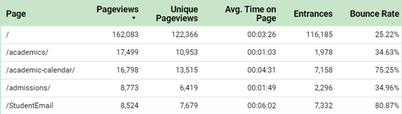
The user of this chart can take away a few bits of information such as:
- The homepage is the most popular by pageviews.
- The /StudentEmail page had a huge bounce rate of 80.87%
But based on this chart, what looks like a problem or opportunity, and what actions need to be taken?
Honestly, the user wouldn’t have a firm idea of what action to take. There is no context to help make any judgment about the performance of these pages. Without context, we struggle to find insight and the dashboard fails to help the user complete their tasks.
For dashboards, context at its most basic is the reporting time period versus the period before.
Context can come from a variety of comparisons, such as time periods, visitor gender, age ranges, device preferences, new vs. returning visitors. These and many more attributes, singly or combined, can help us add context to data. Clarity and context are what make dashboard charts and graphs useful and actionable.
Final Thoughts
Dashboards, while popular, are often less useful than they could be. Building a dashboard is more than creating a pleasing way to visualize data. It requires thought about what data a specific set of users will need and how best to organize it to make the data accessible. We want to keep a dashboard focused on its intended audience, surfacing answers to their most common questions while giving indicators on where more data digging is required. To be truly effective, dashboards must offer context for the data it presents.
We equip our teams well when we consider dashboards as a reference library for anyone on the team who needs answers. Dashboards aren’t data silos; they offer a focused view, filtered by role, of the larger Analytics data set. Dashboards work with Analytics; they don’t replace it. A dashboard has done its job when it provides an answer to common questions, identifies problems or opportunities, or prompts the user to dive into the Analytics platform itself for additional analysis.
Ready to Get Started?
Reach out to us to talk about your strategy and goals.