Written by
on

Before the pandemic, I was in a focus group with community college students, asking about their experience on college websites. One young man kept complaining about all the empty pages. “Page after page,” he said. “Nothing there.”
I pressed him on this, trying to understand how the pages could be empty. “They were nothing but words,” he explained. The writer in me died a little that day.
We Need the Words
Most of the content we seek online, especially around education or health care, is in the form of words, and should be. How can we deliver that content without drowning it in its own nothingness?
We know how: don’t deliver it as a wall of words. Break it up. We learned this lesson in print, almost a decade ago, in a different focus group.
Usability Testing the Words
As we worked on the viewbook for a private, liberal arts university, we did audience research that included a live focus group of a dozen high school juniors and seniors. We showed them two different opening spread layouts.
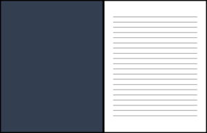
One was a very common, big impact layout: large, full-bleed photo on the left, with a beautifully typeset page of lovely prose on the right.
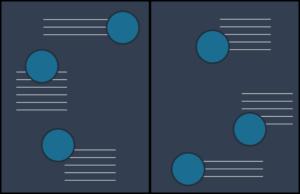
The second layout broke the same content into small chunks, scattered across the two pages, with a large background image and small thumbnail images accompanying each chunk of text.
You won’t be shocked to learn the second layout was the hands-down favorite. No one even gave the first one a second glance. “Too many words.”
It’s Not the Word Count
The kicker? The word count on the two spreads was the same.
TL;DR (Too Long; Didn’t Read) is not a response to word count. It’s paragraph and line length, as well as the space around each. It’s whether the page or screen is scannable—and whether that scan delivers meaningful content through headlines, subheads, and photos.
Presentation Is Everything?
You might be tempted to say that the design makes the words seem readable. Yet, it’s more complex than that. Although the word count and topics were consistent, the content changed. Each chunk needed a subhead that worked with the logic of all the other subheads. This changed the words. The feel of this page called for a different tone, a different pace for the language. As the language changed, the layout evolved, too. It was a dance between the two crafts, writing and designing.
Make Space for Magic
What can we take from this for our digital practice? We design components and the visual language of the site; we don’t layout pixel perfect pages. We type into WYSIWYG boxes in a CMS and dream about ways to make our pages of content look better. We are more siloed than ever, we writers and designers.
Our skills need each other. Design carries purpose with real words. Words become more readable when well presented. We must make the time and the space for them to work well together.
In real life, that means letting website editors try different blocks. Set up a sandbox where they can see what the five-paragraph story looks like if edited and broken across three cards. Get your digital assets (photos) organized and try for more interesting pairings of image and word. Every quarter, have a designer and writer review your highest exit page and see if they can guide visitors to a different action.
During website redesign projects, when everything is up in the air and moving too fast, Stamats strives to bring the two disciplines together, to allow them to talk to each other, literally. We call it model content and use-case layouts.
Words that Work
The magic happens in the difficult, nobody-has-time-for-this, non-metaphorical conversations among writers and designers about how many words you can or should fit on a card or what to do about the 12-word perfect headline.
For our words to carry water, to be worth reading, to be content, shape them for the space in which they will work.
Related reading: Accelerated Content Pathways
Ready to Get Started?
Reach out to us to talk about your strategy and goals.