Fort Lewis College
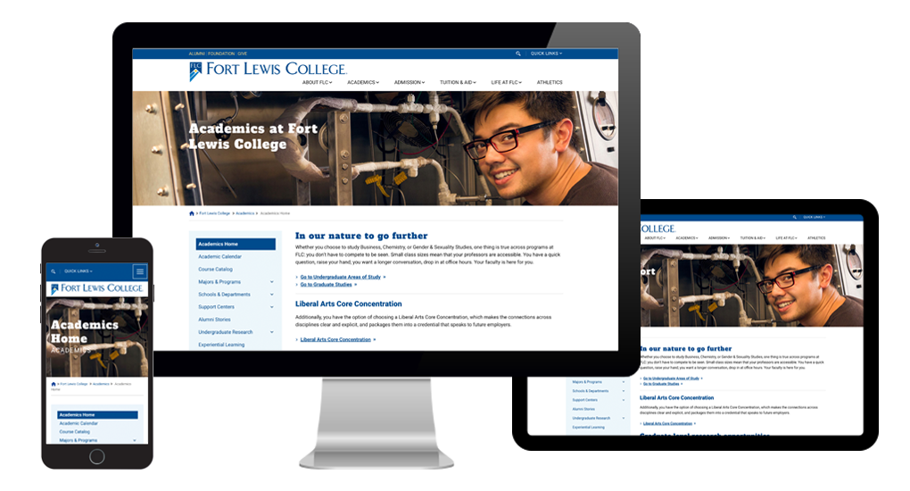
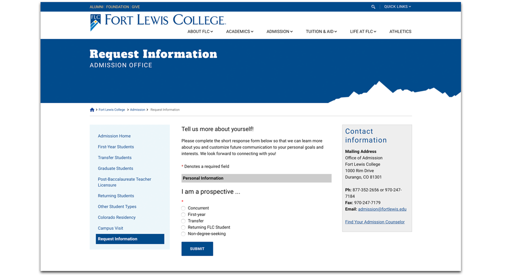
Fort Lewis College’s (FLC) previous site spread across 170 separate portals, without coherent inter-navigation, stranding and disorienting visitors. The new site creates memorable journeys, with an information architecture built around user tasks and a visual interface infused with the brand’s energy and openness.
25%↑

Increase in new users
51%↑

Increase in pageviews
74%↓

Decrease in bounce rate

Nestled on a mesa in Durango, Colorado, FLC attracts students from 50 states, 17 countries, and 145 Native American tribes and Alaskan Native villages. They come for the challenging education, the shared drive for freedom, and the beauty and history of the Four Corners.
The college undertook the website redesign as the logical next step in a redesign of its brand. As its visual language and brand character developed, the college sought ways to improve the website experience.
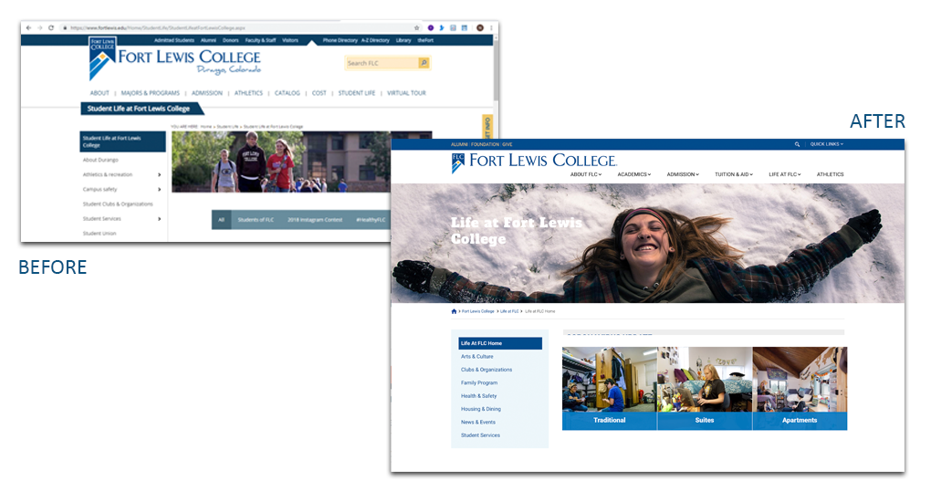
The former website disappointed on the surface, with an outdated look, and in its cumbersome architecture, built out separately run portals in DotNetNuke (DNN). Navigating the site was more disaster than adventure—spelunking through old content or breaking a trail through brambles to find related pages.
This redesign required a close partnership between Stamats and the FLC web team, as the college streamlined the site’s structure and reviewed DNN updates to adopt for the new site. The 170 portals served as governance structures on a widely distributed network of content contributors. As the portals were reigned in to 10, FLC also had to bring content under the central team’s control.
The new brand had both a design and an editorial voice. We worked closely with FLC to create a visual and a content strategy that allows the new brand to speak.
Did we mention the three-month timeline to launch a better site? Our solution to that was a phased launch, making the most of Stamats’ mastery of flexible templates. The new navigation and look launched on time, using most of the existing content in simpler versions of the new templates. As content is reshaped to work on a modern site, new modules can be activated. Over time, the simpler templates become the more dynamic ones of the new site.
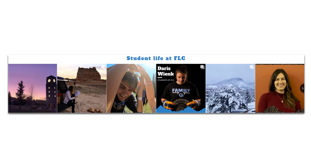
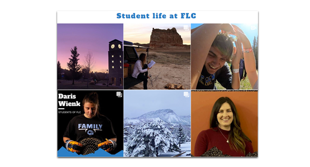
The new site creates an active user experience with subtle motion effects to create depth. All along the navigation paths, users find journey-appropriate calls to action and pointers to related content. Underneath it all, a cohesive architecture and flexible template that means this site can grow and adapt.
The site year-over-year stats tell an impressive story.
Users up 17.48%
New users up 24.92%
Pageviews up 56.80%
Pages/session up 51.38%
Bounce rate down 73.77%
Home page 71.78% increase in pageviews
-
The Challenge
Nestled on a mesa in Durango, Colorado, FLC attracts students from 50 states, 17 countries, and 145 Native American tribes and Alaskan Native villages. They come for the challenging education, the shared drive for freedom, and the beauty and history of the Four Corners.
The college undertook the website redesign as the logical next step in a redesign of its brand. As its visual language and brand character developed, the college sought ways to improve the website experience.
The former website disappointed on the surface, with an outdated look, and in its cumbersome architecture, built out separately run portals in DotNetNuke (DNN). Navigating the site was more disaster than adventure—spelunking through old content or breaking a trail through brambles to find related pages.
-
The Project
This redesign required a close partnership between Stamats and the FLC web team, as the college streamlined the site’s structure and reviewed DNN updates to adopt for the new site. The 170 portals served as governance structures on a widely distributed network of content contributors. As the portals were reigned in to 10, FLC also had to bring content under the central team’s control.
The new brand had both a design and an editorial voice. We worked closely with FLC to create a visual and a content strategy that allows the new brand to speak.
Did we mention the three-month timeline to launch a better site? Our solution to that was a phased launch, making the most of Stamats’ mastery of flexible templates. The new navigation and look launched on time, using most of the existing content in simpler versions of the new templates. As content is reshaped to work on a modern site, new modules can be activated. Over time, the simpler templates become the more dynamic ones of the new site.
-
The Results
The new site creates an active user experience with subtle motion effects to create depth. All along the navigation paths, users find journey-appropriate calls to action and pointers to related content. Underneath it all, a cohesive architecture and flexible template that means this site can grow and adapt.
The site year-over-year stats tell an impressive story.
Users up 17.48%
New users up 24.92%
Pageviews up 56.80%
Pages/session up 51.38%
Bounce rate down 73.77%
Home page 71.78% increase in pageviews