Stamats Insights
June 13, 2018

Website usability is a broad term that encompasses many site dynamics —each one critical as more and more people turn to the web as their primary source of information. Key team members such as information architects, visual designers, and web developers must each have a good understanding of usability principles in order to deliver a stunning college or university website.
At Stamats, we understand the importance of usability. Creating a compelling, research-based, data-driven user experience requires an investment that many institutions and colleges are hesitant to make. With the goal of improving usability no matter what your budget, we’ve condensed eight of the most common usability mistakes we see on higher education websites.
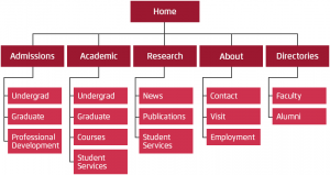
Many institutions that take the time to evaluate their website’s IA (Information Architecture) go about it the wrong way. While it may make perfect sense to your board members and staff, structuring a website around your various departments or products is a very institution-centered approach. There’s a good chance that this structure will alienate some of your most valuable audiences —including current and prospective students. While it’s important to meet the needs of all constituents groups, remember that your website is the foundational marketing tool for reaching external audiences.
Tip: Conduct user testing to truly understand what structure will work best for website visitors who may not be familiar with your institution. Talking to real people to discover their questions, needs, and challenges can provide a whole new perspective.
IA categorizes information in a structured way so audiences can find what they need quickly. As the centerpiece of your website design and development, IA supports the visual design, content, functional requirements, and technical implementation of the website.Without an intuitive structure in place, users will get discouraged and quite possibly leave the website without ever having the opportunity to learn more.
Tip: Invest in Information Architecture. Your website should clearly point users to the information they’re looking for with the fewest possible obstacles. As your website evolves, reevaluate your IA to ensure that it still supports user needs, goals, and tasks.

Usability is a technique for evaluating a product and/or website by testing it on users in order to better understand interaction and behavior. By directly observing how real students (and other important constituents) use the website to complete tasks, testing can offer valuable design insights. For example, something as simple as moving calls-to-action from the left side of the screen to the right can make a big impact in the user experience, bolster your brand, and encourage click-through.
Tip: Conduct thorough usability testing by engaging 5-7 hand-selected individuals from your target audiences. Monitor and record how participants navigate your test site to complete common tasks. Pay close attention to areas that are unclear, have confusing design cues, or have key points that go unnoticed.
Over the years, we’ve found that many institutions are offering exactly what their target audiences need, but they’re calling it the wrong thing. For example, working adults who are considering taking classes at their local community college may not identify with a website section entitled “continuing education.” And in other cases, high school students don’t always self-identify as “undergraduate students.” Many are simply unfamiliar with the term.
Tip: Think like a student. Use plain language and descriptive text whenever possible. To test your terminology, listen to your audiences (we can’t emphasize this enough). Focus groups comprised of prospective and current students are an easy way to learn more about what makes sense to users and what leaves them confused.
Academic writing tends to be formal and verbose. When writing a thesis, dissertation, or research report, it’s strongly encouraged to be as detailed as possible. However, the web is a different animal. Your site visitors are looking for specific pieces of information and they are looking to find that information quickly.
Tip: Strive to keep prospective students’ attention and communicate the top benefits for attending your institution quickly. It’s best to hit the highlights using brief statements with links that invite the reader to dig deeper. Write content that’s easy to scan quickly and use sub-headings to break content into short sections. Call out important facts and figures with different formatting and helpful icons. Use bullets and numbered lists wherever possible.
While most websites have compelling and informative content, many fail to give the user clear direction about what to do next. Website visitors may be new to the process of searching for information about courses, financial aid, housing, etc. Effective calls-to-action makes it easier for users to take the next step in their journey.
Tip: Focus on the primary tasks and informational needs of your users (e.g., register, schedule a campus visit, or request more information). Use clear language and leverage visual elements such as buttons and graphics that catch the users’ attention.

We’re happy to report that this mistake is becoming a rarity as more schools focus on making their websites accessible for all audiences. Updates include everything from the way the website is coded to the visual design (color contrast, type size, etc.) and the content itself (captions for videos and images).
Tip: Determine the level of accessibility that’s required for your school and become familiar with those guidelines. Then, conduct an audit to see where the site is meeting criteria and where it’s falling short. Having clear documentation about what needs to be updated will help you to prioritize areas that need the most work.
It’s the responsibility of website creators to design delightful user experiences across all digital platforms. Small elements on the website —from HTML5 video starting automatically to image roll-over animations —factor into a website’s overall usability.
Mobile usage has continued to increase with no end in sight. Recently, Google announced that in the US, more searches take place on mobile devices than on desktops. This means that if a prospective student uses Google to search for your institution, there’s a good chance that first encounter will be on a smartphone.
Tip: Get creative and embrace technology! Schedule regular brainstorming sessions with your team to generate new ideas to make your website stand out. Always remember to revisit your strategic goals before making any site changes. Once you’ve determined what technology will help you achieve the best results, you’ll be even more inspired to develop a memorable site experience.
From website design to CMS integration and content strategy, Stamats offers a wide range of services designed to help schools fully embrace the Digital Age. Find out more about our digital solutions here.
Ready to Get Started?
Reach out to us to talk about your strategy and goals.