Written by
on
As marketers, optimizing websites is a key part of our job. Separating mobile and desktop traffic can provide much clearer insight into user behavior and lead to better decisions about what to optimize and why.
When we looked across multiple institutions, one pattern consistently emerged: device choice is often tied to where students are in their decision-making process.
Mobile drives a meaningful share of inquiry activity, while desktop generates most of the application activity.
The takeaway isn’t that one device matters more than the other. It’s that prospective students use them differently. Here are three findings to consider in your website optimization strategy.
1. Students Don’t Use Your Website in a Single Session
One of the clearest findings from our research is that the student journey is rarely a one-and-done experience.
Across institutions, most website sessions occur during daytime hours, with roughly 55%-65% of traffic happening between 9 a.m. and 5 p.m. At the same time, mobile use becomes significantly more important during evenings and other off-hours, where it represents roughly 40%-50% of sessions.
This suggests that prospective students are engaging with institutions throughout the day, not just during a dedicated college search session. A student may discover a program while scrolling on a phone between classes, revisit the site later from a laptop, and return after speaking with a parent, counselor, or advisor.
Website visits are often part of a longer decision-making process that includes multiple sessions, devices, and touchpoints. Rather than designing for a single visit, institutions should assume users will come and go several times before acting.
The question becomes: When they come back, can they easily continue where they left off?
2. Mobile and Desktop Serve Different Jobs
The data suggests that mobile and desktop users are often used for different parts of the enrollment journey.
Desktop remains the dominant environment for application-related activity, generating roughly 64% of application actions across the institutions reviewed. Desktop also accounts for approximately 60%-70% of sessions during peak daytime hours
Mobile, however, plays a significant role in inquiry and engagement behaviors. Mobile users account for approximately 40%-45% of inquiry and form-based actions and more than one-third of application-related activities.
What does this mean for marketers? A prospective student researching programs on a phone is often looking for quick answers:
- Does this school offer my major?
- Are the outcomes good?
- Can I afford it?
- How do I learn more?
By contrast, completing an application is a longer, higher-commitment activity that often requires gathering information, reviewing details, and dedicating focused time.
Different devices support different moments in the decision process. If your website is optimized for one experience but not the other, you may be creating friction where students are trying to move forward.
3. Design for Continuity, Not Devices
It’s common to design for a responsive experience where the site adjusts for mobile, tablet, or desktop. A better approach is to design for movement between devices. If prospective students are researching, comparing, and engaging across multiple sessions and devices, your website should make that transition as easy as possible.
Consider ways to help users continue their journey, including:
- Saving program information for later review
- Emailing page links or content to themselves
- Providing clear next-step calls to action
- Creating application pathways that are easy to resume
- Reducing friction in inquiry forms
Applying the Research
The most successful enrollment websites aren’t simply mobile-friendly or desktop-friendly. They’re designed to support a decision process that unfolds over time. Students research during the day. They return at night, move between devices, compare options, ask questions, then come back.
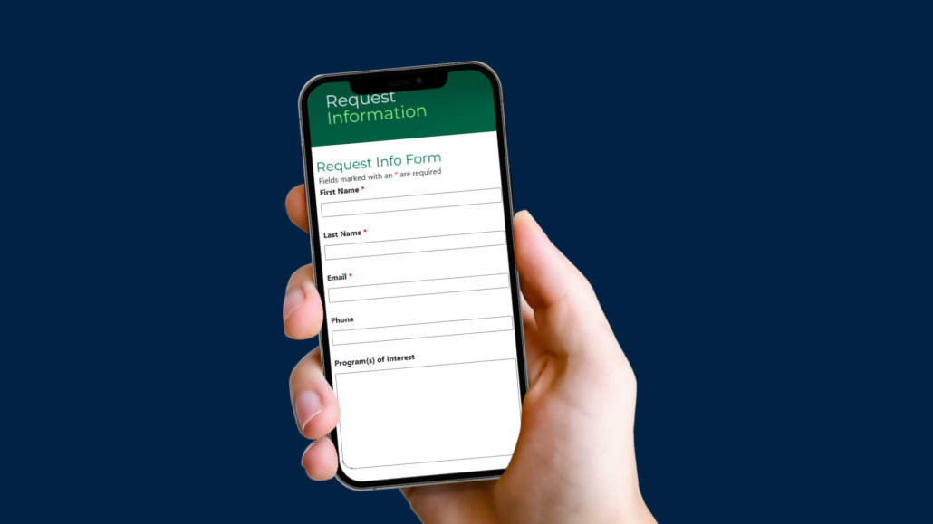
One of the clearest examples of these connections involves Request Information forms.
If nearly half of inquiry-related engagement is occurring on mobile devices, every additional field introduces more effort and increases the likelihood of abandonment. While teams often want to collect as much information as possible upfront, marketers should focus on collecting only what is needed to begin the conversation. Additional information can be gathered later through nurturing, advising, and follow-up communications.
The goal is not a perfect lead profile. The goal is to help a prospective student take the next step.
Need help proving a long RFI form is hurting conversions? Analytics can tell you exactly where users stop as well as A/B testing. Talk to one of our experts to configure reporting.