Is There an Ideal Patients & Visitors Layout?

Category: CMS & Website Redesign
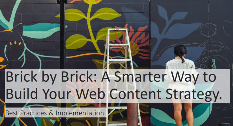
  • Is There an Ideal Patients & Visitors Layout?

    Is There an Ideal Patients & Visitors Layout?

    Today, I’d like to dive into the last question on Patients and Visitors. While not every hospital and organization can fit the same model, there are some standard best practices.  What follows are four key best practices I recommend including to effectively structure that content. 

    1. List all the amenities and services available to patients and visitors. 

    A typical list would include topics like:

    • Accessibility 
    • Cafeteria 
    • Events Calendar 
    • Getting Here 
    • Gift Shop 
    • Hotels and Lodging 
    • Insurance & Billing 
    • International Patients 
    • Maps & Directions 
    • Medical Records 
    • Parking 
    • Pharmacies 
    • Places to Eat 
    • Safety & Privacy 
    • Security 
    • Spiritual Care 
    • Transportation 
    • TV Channels and Internet Options 
    • Valet Parking 
    • Visiting Hours 
    • Visiting Policies 

    Looking at a sampling list of this size makes it clear why organization is so crucial! 

    2. Chart those amenities based on whether it is helpful to the patient, visitor, or both. 

    Most likely, you will find that it is helpful to both. For example, a spouse or parent may want to know what Internet options are available, the same as the patient. 

    3. Determine if information is custom to locations. 

    If yes, the strategy needs to account for this. Will you make a global overall page and then individual pages at the location? 

    4. Determine how to structure the information.

    Assuming many of your tasks were shared in the second exercise, you have determined that sorting under Patients and sorting under Visitors is not the most beneficial way, as there is too much overlap. 

    So, what is the best way if the audience type is not the best solution? 

    There are two recommended structures: 

    1. Categories  
    2. Alphabetical Accordion 

    Category-Based Navigation 

    One of the best ways to define categories is card-sorting. Create a card, either digital or on paper, and start grouping them together. 

    You might go with fewer categories, like Mayo Clinic: 

    • All about appointments 
    • Planning for your trip 
    • While you’re here 

    Or you might find that you need additional categories to drill down more easily to the topics.  Some common categories are: 

    Insurance & billing 

    • Manage my Care 
    • Patient Portal 
    • Refill a Prescription 

    Telehealth Options 

    • Video Visit 
    • Telephone Call 
    • Secure Messaging 
    • Remote Patient Monitoring 

    Prepare for your visit 

    • Items to Bring 
    • What to Expect 
    • Services Within the Hospital 
    • Dining Options 
    • Banking & Money Services 
    • Gift Shop 

    Maps & Directions 

    • Floor Maps 
    • Driving Directions 
    • Parking & Valet Services 

    Support teams 

    • Spiritual Care 
    • Animal-Assisted Therapy 
    • LGBTQ+ 
    • Language & Interpretation 
    • Veteran Program 
    • International Patients 

    Location-specific Amenities 

    • Dining and Cafes 
    • Maps and Parking Specific to the Location 
    • Hours if Different from Other Locations 

    A word of caution on Where to Stay and Where to Eat. There are two considerations: 

    1. The list will need ongoing maintenance. 
    2. The visitor assumes you are endorsing those. We have heard many stories where families were dissatisfied with their experience at a local hotel or restaurant listed on a hospital website, which impacted their overall hospital experience. 

    Instead, consider linking or embedding a Google Map to find services “Near Me.” Make sure to add a disclaimer under that link that you are not endorsing these businesses. 

    As you begin your card-sorting, remember one guiding rule. It is best not to exceed nine categories. That is the upper limit of being able to easily consume the content. 

    Alphabetical-Based Accordion

    Even within a category, you may choose to use an accordion. Accordions work best when you need to scan a large set of data and select a few to read more. Keep the headings short and the keyword at the beginning. 

    What about the navigation label? 

    Patients & Visitors is the most common. 

    A few other examples: 

    • Your Visit 
    • Patient & Visitor Guide 

    Regardless of your navigation label, don’t complicate your URL. There is no benefit to /patients-visitors. Keep it simple with just /patients or just /visitors. 

    The above examples all perform well in testing. Keep it clear and simple, and do not use internal language; your label should perform well. 

    What else am I missing? 

    While factual information is important, remember to showcase your services and remind them why you are. Focus on the benefits of the service, such as valet parking, patient massages, etc. 

    Close with a marketing statement about yourself and testimonials or patient stories that discuss the excellent care they received.

    Final tip: Your patient call center, your welcome desk, and other patient touchpoints are excellent sources of content that your patients and visitors need. Interview them and find out commonly asked questions. 

    Keeping these four best practices in mind when crafting your Patients and Visitors page is one important step to your site’s infrastructure. We know that you may not have the time or in-house expertise to execute this efficiently. Consider a page audit by our talented team at Stamats. Our team is the right size to be your team-for-hire. Big enough that we have experts in every area to lean on (even if they aren’t on your project!), yet small enough that you don’t get lost among our other work. 

    Ready to strategize? Contact us today for a free consultation. 

  • 10 Key Elements to an Effective Homepage

    10 Key Elements to an Effective Homepage

    In 2020 and beyond, homepage aesthetics and functionality are equally important. A poorly executed homepage can be just as detrimental to your brand as dirty windowpanes.

    But fear not—you can achieve homepage zen with the right balance of navigational finesse, optimized images, and scannable content.

    Use these 10 key elements to attract and retain prospective consumers who are searching for your services, solutions, and offers like yours.

    1. Navigation Hierarchy

    Your website’s navigation, also known as the menu, is one of—if not the—highest-trafficked areas of any website.

    Here, consumers expect you to highlight your website’s most important aspects. Failing to do so can frustrate your audience, who will bounce out due to the poor user experience.

    Use your site analytics to determine which pages are most visited by new and returning users. The top pages should be strategically surfaced to your site navigation. Unsure which webpages or aspects to highlight? Schedule a free consultation with a Stamats UX expert.

    2. Hero Image or Banner

    Many times, the hero image is where the user experience starts. Typically, hero images or banners expand the full width of the browser window and take up large portions of the homepage.

    The major presence of photos and/or videos brings attention to your products. You can also add catchy headlines and a CTA button to guide visitors to other key sections of your website.

    3. Highlight Areas for Unique Selling Points

    What makes your company unique? How does it stand out in your crowded marketplace? If you don’t show the answer, how will your visitors know?

    On your homepage, highlight what makes your company different from competitors. Illustrate your uniqueness through the website using photos, videos, or infographics.

    4. Unique, Quality Photos

    Notice how I didn’t mention stock photography? Ew!

    Stock photos are nice if you’re in a pinch and need a place holder. But if you expect paying consumers to remember you, consider options beyond a stock image that anyone with $50 can buy. Organic, unique, high-quality photos showcase your services better long-term than any stock photo could.

    Remember to optimize and compress your photos. Use lightweight image files to help Google bots crawl and index your images. This allows your website’s organic traffic and online presence to grow daily.

    A critical item to consider is how this will impact your website’s overall load speed. According to research from Google, 53% of website visits are abandoned if a mobile site takes longer than three seconds to load.

    5. Clear, Catchy Headlines

    In today’s busy world, few people read full pages of content. They rely on clear and catchy headlines to scan the page for information they need and skip what they don’t.

    Website visitors should be able to quickly understand what you offer and your services by scanning your headlines and subheadings. These queues are your chance to grab your audience’s attention and increase your online ranking and on-page SEO.

    6. Fresh Content that Speaks to Your Visitors, Not Your Ego

    It’s important your website’s content stays fresh not only for your customer base but also to help Google bots crawl your website and obtain the latest information.

    Consider scheduling a monthly governance reminder to keep your content updated. Check and revise your assigned section of website regularly to keep it up to date with the latest audience needs. Want governance advice? Schedule a free consultation today.

    Focus your content on how customers can benefit, not all the awesome awards you’ve won. Dedicate a small (not too small, haha!) section of your About Us page to highlight your accomplishments as a tasteful selling point.

    Also, include your business phone number, location, and hours of operation within your homepage content or in the footer so it shows on every webpage of the website.

    7. Content Offers

    Website users are at different stages of their user journey, which is why it’s important to include content offers, such as whitepapers and ebooks.

    A website visitor may not be ready to buy, but they may be ready to download. Make sure to include a relevant next step and call-to-action on the downloadable piece, along with your email address and phone number.

    8. Customer Testimonials

    Customer reviews are extremely important to gain credibility and get more traffic. When new visitors see reviews from current and previous customers, their trust level increases. With trust comes added confidence in their decision to do business with you.

    9. Contact Form and Information

    Websites often lose potential buyers if they fail to integrate a contact form into their website. A working contact form allows potential customers to email you directly from your website, creating a low-pressure user experience. Lead generation increases when users are satisfied with their experience.

    10. Social Media Integration

    Social media is a world of its own. Integrating Twitter, Facebook, or Instagram into your website affords you new engagement opportunities. In the digital age, all audiences expect brands and companies to be on social media.

    Put thought into the strategy behind your homepage design and layout. Incorporating these 10 elements will put you on the right track to feng shui your user’s experience and direct them to the content they need to convert.

    Is it time to update your homepage user experience? Schedule a free consultation now.

  • How to Create a Better RFP Experience

    How to Create a Better RFP Experience

    Sounds good, but in practice, many higher education institutions find this not to be the case. Administrators that send out RFPs are often frustrated with the proposals they receive because they are unresponsive or off base. And consultants who receive the RFPs are often confused about what is being sought and why. The result is predictable. Even though the number of RFPs is growing, we know from our own experience and conversations with other consultants that the number of RFPs that consultants respond to is on the decline.

    Recognizing this trend, I wanted to take a few minutes and offer some concrete ideas on how to make the process more effective for both clients and consultants. In our experience, a great RFP has five key elements:

    • Introduction: A clear overview of the project is essential. Not only does this force the client to think through what they are seeking, but it also gives the consultant a complete sense of the project rationale and goals.
    • Project scope and requirements: This section of the RFP should detail exactly what is sought and why. As with the introduction, clarity at this point is essential because it will allow vendors to provide a customized, detailed response. It is also useful to disclose other consulting relationships you have. This enables responders to your RFP to dovetail their response with the resources you already have in place.
    • Review process: Be clear about who is on the decision-making team and how the proposal will be evaluated. Too often, vendors write a proposal and then present to one team, only to have someone not involved in the process make the decision. In some cases, the client team may have made a choice on who they want to work with only to be overruled. This approach undermines the selection process and project implementation.
    • Timeline: There are actually two distinct timelines in play. First is the timeline for the RFP process, including dates for consultant Q&A, any required on-campus meetings, and when the RFP is due. Then there are the dates for the project itself. As for the proposal-response time, realize that unreasonable response times of less than a week and a half will result in fewer consultants responding to the RFP. Qualified vendors who are already busy with commitments to clients won’t have time to formulate a proposal as tailored as it might otherwise be. Regarding project-completion dates, know that complex projects often have multiple due dates. Make sure the dates are both realistic and in logical order. For example, don’t have the production of a new website ahead of the date for completing research that will inform your website strategy. Finally, make sure the due dates are consistent throughout the proposal. It is not uncommon for one section of the RFP to have one set of due dates followed by conflicting dates in the next section.
    • Budget: Colleges and universities often withhold budget information from the RFP. However, in the absence of budget information, some qualified consultants may elect not to respond. A better strategy is to include budget ranges for key components. Not only does this evidence a commitment to the project on your part, but it helps responders understand if you have an idea of what dollars are required for project success.

    Research More About the RFP Process: Higher Education RFP Best Practices

    Beyond the nuts and bolts of the RFP as a document, there are a number of safeguards that should be built into the process. Before sending out an RFP, make it a point to account for these considerations:

    Speak with one voice. RFPs are increasingly the work of multiple writers, which can result in a conflicting mixture of voices, strategies, goals, and definitions. Or worse yet, the RFP contains elements that have been cut and pasted from other documents. It is frustrating for consultants to read an RFP about enrollment only to discover one or more pages on specs for building a new residence hall. Take the time to edit your RFP so that it has a single voice, clear objectives, and follow-up details.

    Do a little research on prospective consultants. Look at their websites and check out their blogs, case studies, and industry thought-leadership contributions to see if their array of products and services is a good match for you before you send the RFP to them. Talk to some of their clients. When possible, query the consultant ahead of time to gauge not only their capabilities but their interest. Even a short conversation on the phone will give you tremendous insight into a prospective partner. You will get a sense of their values, approach, and even whether or not they are a good fit for you. These insights will prove invaluable if the project hits a speed bump. In such cases, you can candidly address the issue because an initial trust level has been established.

    Include a Q&A period. This allows vendors to gain a greater depth of understanding and ultimately results in a better proposal. For significant RFPs, give consultants a chance to visit campus, meet major decision makers, and conduct interviews if desired. This will make for a more customized response. Also give ample time between the Q&A period and the proposal due date so the consultant can incorporate what they learned into the proposal.

    Research More About the RFP Process: How to Write a Solid Higher Ed Website RFP

    Don’t let the purchasing process overshadow the purpose of the RFP. While there are often legal requirements for RFPs, the purchasing process can sometimes overshadow the purpose of the project. Involve purchasing and follow applicable legal procedures, but make sure the professionals who actually need the requested services have a big voice in developing the RFP and choosing the vendor. In addition, make sure there is agreement throughout the body of the RFP and cover letter for all forms and documents that must be reviewed, signed, or supplied by the prospective consultant.

    Resist the temptation to send out an RFP to dozens of consultants. When consultants receive an RFP, they typically calculate the odds of securing the project. If they know that the RFP was sent to 20 other firms, their interest in responding declines. A much better strategy is to identify a handful of companies that are a best fit for the project. This saves you time in evaluating multiple RFPs of varying quality and increases the likelihood that you will get a response from the vendors you are interested in most.

    Resist the “my way or the highway” approach to RFPs. Avoid writing an RFP that is so specific or prescriptive that it is resistant to input from the consultant on how the project might be enhanced. Good consultants want to meaningfully differentiate themselves from their competitors—an overly strict RFP means they will be forced to limit their response and diminish the value they offer. The resulting “sameness” from all vendors means the best ideas might be exempted from consideration. Making sure the prospective consultant knows you are open to new ideas can vastly improve the quality of the project.

    Put a limit on the length of the proposals you want to receive. When vendors know they only have 10 or 15 pages to supply, the quality of the proposal will instantly improve because they will only focus on the key issues. The benefit to you is fewer pages to wade through looking for the essentials. For clarity, also make sure the prospective consultant knows if the required forms are to be included in the page count.

    In the end, it comes down to a people thing. In other words, fit matters. Choosing a consulting partner is more than project specs and timelines. While vendor portfolios are important, so are personalities. Make sure your proposal process includes ample time to get to know prospective partners. This is especially important if you were not able to screen potential vendors before you sent out your RFP.

    Consider issuing an open RFP. We have seen a number of institutions employ an open RFP under which a number of vendors are approved to receive work as the need arises during the RFP’s effective period. For example, under an open RFP for marketing services (a purposely broad category), various vendors are qualified to provide actual marketing work without the need for further RFPs. Vendors selected to provide work are determined by the need and fit with a contract for services negotiated individually and often with the assistance of someone from purchasing. The benefit is that the cumbersome RFP process is only done once, and buyers within an institution still have choices that they can make based on a particular need. For example, one firm might appear on the approved list of vendors that can provide marketing-research services. Another might be on the list that can provide event-production services.

    While RFPs are useful in many situations, there are also times when they are not the right approach. Here are four scenarios when it is not advisable to send out an RFP:

    1. There is no current funding for the project. Colleges and universities are increasingly using the RFP process to fish for new ideas and approaches or determine budget requirements. When vendors sense a fishing expedition, they are less willing to respond to the RFP. Consultants talk to one another—you don’t want a reputation as someone who abuses the process.
    2. You already have a consultant in mind. If you know who you want to work with, don’t waste everyone’s time by going through the motions. Doing so creates unnecessary cost and waste in the service ecosystem, which then becomes a cost of doing business that is ultimately passed on to the consumers of those services.
    3. There is no buy-in from the leadership team for the project. To be successful, a project must have buy-in from the senior team. Nothing derails a project faster than a senior team that is not committed to the work.
    4. You are not sure what you want to do. Rather than sending out an RFP, send out a much simpler RFI (request for information). It is easier to respond to, and you can hire a consultant to help prioritize your needs if you are not sure what to do. This can be especially helpful when you have a number of critical issues all vying for attention, when the senior team has multiple ideas on how to proceed, and when there are inconsistent expectations or tight budgets.

    These best practices will help you develop better RFPs and increase the likelihood that the consultants you are most interested in working with will respond.