Who’s Not Coming to the Party and Why? Tips to Attract Attention from Non-Engagers

Tag: Articles

  • Who’s Not Coming to the Party and Why? Tips to Attract Attention from Non-Engagers

    Who’s Not Coming to the Party and Why? Tips to Attract Attention from Non-Engagers

    Who’s falling out of the process and why? How does the group of non-engagers look in comparison to those who are engaging? Perhaps there are geographic or demographic differences? As a marketer, it’s your job to find just as much interest in the people who aren’t doing what you’ve worked so hard to accomplish through your marketing as it is for those who are.

    Here are six tips to consider if non-engagers are keeping you up at night.

    1. Place value on the audience that doesn’t engage. Build your communication plans with “nurture and convert” in mind and include “level-up” tactics to attract those who didn’t respond. This doesn’t mean just changing the content or design—it means putting yourself in the driver’s seat of the person who didn’t respond to your message and thinking “What would I need to find this message interesting enough to respond to?”
    2. Do your research. Analyze all the available data in both sets: the responders and non-responders. You might find some surprising results sitting in plain sight from a geographic or demographic perspective. Then learn, adjust, and measure again.
    3. As marketers, we like to push. And sometimes that mindset puts you in a transactional mode of developing marketing tactics. Review your communication for transactional speak. We’re told to pay our bills by this date. This kind of transactional speak doesn’t resonate well for people who are making big life decisions like choosing a major or a college.
    4. When reporting on marketing progress, be sure to include data and information about those who aren’t responding or engaging. This places importance on non-engagers. Have active conversations about what the non-engager audience looks like.
    5. Many communication plans are built on a timeline. Once that timeline is completed, it ends. If 20% of the people you’ve communicated with advance to the highest possible level, that means 80% are still in limbo. And for some, getting and maintaining that full audience costs money. How much did it cost to lose that 80%? Consider it reverse ROI. It might not be comfortable, but it’s important.
    6. Finally, build in a “sustaining” communication plan. The 80% who remain inactive just might not be ready. But don’t give up on them. Your plan should include ongoing communication over a longer period. Fill this plan with outcomes, benefits, and proof of why they should engage with you.

    Ultimately, many will never engage. And that’s okay. But feeling confident you “see” them is important and may very well give you the kind of insight you need to continually refine your communication plans.

    Strategic communication plan development is part of a user journey mapping workshop Stamats offers. We’ve created hundreds of communication maps to help colleges and universities optimize their marketing performance and improve confidence in communication processes.

    Ready to get started? To discuss marketing or communication plan development or if you’re interested in the user journey mapping workshop, contact Sabra Fiala or schedule a 30-minute meeting

    Related Reading: 6 Tips for Confident Marketing Tracking

  • Universal Analytics Data to be Removed in 2024, Should You Be Worried?

    Universal Analytics Data to be Removed in 2024, Should You Be Worried?

    That sounds straight forward, one of your tools being replaced with another newer version, and the older tool will still hang out in your toolbox for about a year.

    Until you give it a beat and it sinks in, all the historic website performance data collected by Universal Analytics since 2005 gets taken away from you on July 1st, 2024.

    All. Data. Gone.

    One Problem, Two Levels

    We should start by acknowledging that losing access to historic site data is a double whammy. First, there is the obvious loss of access to information on historic site performance, a loss that is likely to affect forecasting in the near term. Then there is the less obvious blow, which is the emotional side of the change, we tend to think of that data as “mine” or “ours”. When someone threatens to take away what we hold to be a possession or a right we get defensive, and while this emotional undercurrent might be less obvious, it tends to live just below the surface and colors our thought processes and planning.

    Loss of Historic Data

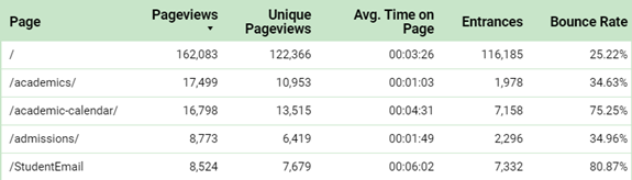
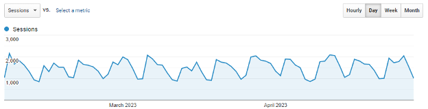
    Anyone who has looked at a chart that plots website session counts by day, and from that chart deduced that their website is far less busy on weekends, has made an analysis.

    Google Analytics capture.

    Analysts use website data collection to learn the behaviors of site visitors, the impact of marketing, and to forecast a path toward achieving an organization’s online objectives. You don’t have to be a full-time Analyst to read and understand most of the charts and graphs about website performance. However, an Analyst goes one important step further by taking that same data and preparing forecasts. “Historically, we did X amount of marketing and got Y new students, so we forecast that if we do X+1 marketing we would earn much more than Y+1 new students”.

    It would be fair to say that Analysts look backward so that they can see forward. All things being equal, the greater the amount of time in that lookback timeframe, the more likely the resulting forecast will be accurate. By removing access to a large block of historic data, Analysts will need to discover other signals in current day data to help them generate forecasts.

    I just referenced “all things being equal”, hold that thought.

    It’s My Data

    Many of us have spent years collecting website data, working to ensure that the data is clean and error-free, and that it is accessible to whoever needs it. We have an ownership-like investment in the data, and that is an emotional tie.

    “It’s my data, how can Google take it away from me?”

    That’s right, it is your data, generated from your website by your site’s visitors. But that isn’t the whole story.

    The data has been collected by a free software platform, using free digital storage, offering free access to anyone with the right set of free credentials. Yet it costs Google hard currency to own and operate the tens of thousands of physical servers used by Google Analytics, and in turn support the infrastructure required to maintain them.

    It’s still your data, Google simply won’t continue to store the old Universal Analytics data, and they will discontinue the software required to access it. If an organization wants to download and preserve their historic website performance data they can, but that storage and access solution won’t be free. Google can move your data to their BigQuery cloud database for a fee. BigQuery requires the use of MySQL language to access the stored information, or it can be connected to Looker Studio.

    Another option is to download most of the data to a platform like Domo which also offers storage and access for a monthly fee.

    Yes, it is still your data, but after July 1st, 2024, keeping it will incur cost.

    Ready to Get Started?

    Reach out to us to talk about your strategy and goals. Email us.

    Some Needed Context

    Perhaps something has been overlooked, buried beneath the threat of data loss, questions about data ownership, and the future costs of maintaining storage and access to the data.

    Why would you want to keep all that the data in the first place?

    Fear of loss can lead to making quick decisions that in the long run don’t benefit the organization. So before committing to preserving historical website data here are a few items to consider:

    The data collected in today’s Google Analytics 4 is fundamentally different than the historical data in Universal Analytics. A few of the differences:

    • The way sessions are counted. The definition of a bounced session. Even time on a page or on the site. None are measured the same way between the two versions of Analytics.
    • The method used to combine site visits scattered across days and weeks and attributing that activity to the same user is very different between UA and GA4.

    If these most basic data points are collected and counted in very different ways, how accurate will it be to compare historic site behaviors to today’ site behaviors? If we don’t have consistency in the data all we’re left with is trends, not scorecard metrics. Maybe we don’t need the details (data), maybe we just need to preserve the trends.

    When was the last time your organization used website performance data from two years ago to create a strategic plan?

    • The way people use the web is constantly changing, we shouldn’t assume that today’s users behave the same way as our users from two years ago.
    • One example is that search engines have been around for over 20 years, yet every day 1 in 5 of the searches performed have never been seen before. If today’s users search differently compared to two years ago, they access your site differently too.

    Because the way people use the web changes almost daily, as performance data ages it risks becoming less relevant as a forecasting tool. While it might be nice to know that you have data on how Organic Traffic performed in 2017, it isn’t terribly useful in today’s decision-making process.

    In both subtle and extreme ways, COVID changed everything.

    • Earlier in this article I stated, “All things being equal, the greater the amount of time in the lookback timeframe, the more likely the resulting forecast will be accurate.” Since February 2020, few things online have remained equal.
    • During COVID people were forced to rely on the web more than at any time before. Casual users became frequent users, power users became even more enmeshed with the web. Increased and more intensive use of the web caused an increase in overall web-savvy behaviors.
    • Today, more than three years after the pandemic started, few higher education websites have achieved the same volume of traffic they had before COVID. Yet many are experiencing more goal completions per user than ever before. Less traffic, but more effective traffic.

    Simply put, indications are that people changed how they use the web, becoming more adept at finding what they need, faster. If the pandemic acted as an incubator period by promoting more advanced usage of the web, then the data on performance during and before COVID becomes far less relevant in assessing and forecasting today’s behaviors.

    Conclusion

    Google will allow us continued access to our Universal Analytics data for one year after the platform stops collecting data. That provides some breathing room to make a considered decision on how – or if – the data should be preserved. We don’t need to rush toward a solution, but then we shouldn’t simply kick the can further down the road either.

    Before committing to the effort and cost of preserving historic Universal Analytics data, an informed internal conversation is needed. Discussion points should include details of exactly what is to be archived, an estimate of the cost to warehouse the data, and any gaps in personnel that need to be filled (by training or new hire) to successfully access and use the stored data.

    The second part of the conversation is the more important one to have, this is where the “Why?” question is asked and answered. How is older data used today, is it simply to create more impressive looking charts? Or is there a supportable business need that mandates access to what happened on the website back in 2018?

    “This is how much it will cost each month/year to download and store Universal Analytics data. We will need to train two or more people on our team in how to use MySQL programming language to access and use the data. We need to do this because the historic Analytics data acts as a check and balance to our CRM solution.”

    • Most colleges probably won’t need to go with a full data storage and access solution. Downloading important reports as spreadsheets could be enough. Depending on what data is identified as important, this download process could take weeks or months, so making decisions and creating a download plan shouldn’t be delayed.
    • Others may elect to go with a short-term solution such as a platform like Domo that can both store the data and create charts and graphs from it. Cost may be slightly higher than Google’s Big Query option, but platforms like Domo have data visualization built in.
    • A very small segment might have compelling need for the warehousing and access provided by cloud storage paired with staff trained in using MySQL or R to extract information. Those in this final group are probably very aware of their situation, if for no other reason than they already have staff or vendors focused on data extraction, transformation, and visualization.

    When it comes to determining the right path and method, there is no blanket recommendation we can make. That said, the important first step remains: “Start the internal discussion as soon as possible.” Stamats can help guide the conversation and offer consultation on each of the processes described. The Stamats Analytics team can also audit your new Google Analytics 4 installation to help make sure it is collecting all the data it should be. We are here to help, simply reach out to your account representative to get the ball rolling.

  • Creating Audience-Focused Content

    Creating Audience-Focused Content

    One of the most relevant points Michael and I shared is this: create the site for the user, not for your org chart. And when you do that, they will come (yes, I’m from Iowa, not far from the Field of Dreams).

    There are two really great examples of areas that were originally focused on the department content. The team at IU was ready to make a change so there was no pushback; their site was dated and everyone was aligned to an audience-based site to message #ResearchCuresCancer.

    Giving – Audience Focused Content

    For more than a decade, the cancer center’s Giving page directed potential donors to an institutional landing page. Instead of actionable content, users had to make their way through unfocused side navigation that had grown over time. If visitors found the giving fund they were interested in, the page was likely too long or too short to impact their decision.

    It was focused on who they were, not the amazing impact they have had on research.

    Before Giving Web Page Screenshot

    Our strategy to create an engaging page: 

    • Emphasize donor impact—tie funding opportunities directly to related research
    • Elevate key donor interests
    • Add patient survivor stories
    • Include researcher photos and testimonials
    • Cross-link event and volunteer pages

    The outcomes:

    • Direct connections between donors and research breakthroughs
    • Personal stories of high-profile scientists 
    • Multiple voices sharing consistent key messages 

    The results:

    • 53% increase in pageviews for the Giving section since launch (January 2023 to January 2022)
    • Significant engagement with landing page calls to action

    Visit the Giving Page live

    After Giving Web Page Screenshot

    Community Outreach & Engagement – Audience Content

    The original Community Outreach & Engagement web page consisted of a rural landscape graphic and a high-level synopsis of the department’s official mission and goals. And that was it—a single page with no branding and no calls to action. This office was doing amazing things, and the page was not telling their story!

    After lively interviews with the OCOE team, it was clear that community outreach and engagement are vital to cancer research, and they were ready to share that message and build community connections.

    Before Community Outreach & Engagement Screenshot

    Our strategy to create an engaging page: 

    • Expand to a full section 
    • Shorten navigation label to “Community” to de-emphasize org chart influence 
    • Surface key messages and stories from social media 
    • Integrate Simon Says video series and promote across the site. The team had invested in this really helpful channel, but it was orphaned on their website as a standalone page—and that meant the community was not accessing this information
    • Move events and volunteering from Giving to Community and reframe content to highlight community impact 
    • Show the full spectrum of diversity across Indiana with lots and lots of people photos 
    • Give a voice to the OCOE team—all-new content emphasizing the scope of their work—engagement statistics, community partners, research articles

    The section outcomes:  

    • Clear user journeys 
    • Prominent calls to action 
    • Meaningful images 
    • Strong voice 

    The results: 

    • Increased engagement within the site: moved from 24th to 6th in clicks from homepage 
    • Simon Says video series now accounts for 47% of traffic through Community section

    Visit the Community & Outreach page live

    After Community Outreach & Engagement Screenshot

    Takeaways and Recommendations

    Write for the audience. This most likely means it won’t look like your org chart. A department’s content might live in more than one navigation menu item.

    A frequent real-life example I share is one we are all familiar with. At the grocery store, the aisles are not aligned by the company products. There is no General Mills, Post, or Nestle aisle. The aisles are aligned by product category, spreading their brands over multiple aisles. Why do stores do this? It’s best for the consumer, and what is best for the consumer is best for the store.

    Tell your stories. Dig deep during the discovery process. Let the subject matter experts talk during stakeholder interviews. Find out what excites them and who the “unsung heroes” are. Listen closely and pull out the threads of recurring themes.

    Make the connections. Craft key messages that weave together those story threads using your unique voice and tone. Use design components to guide users through their journeys. Give them opportunities to answer the calls to action and discover related content. Make use of dynamic content to maintain the momentum.

  • 6 Tips for Confident Marketing Tracking

    6 Tips for Confident Marketing Tracking

    It would seem logical to jump right in with campaign tracking, but we need to begin with coding structures in the CRM or marketing platform used to house your prospect data. There are specific codes (sometimes referred to as source codes) that are often prebuilt and associated with prospect data. Quite a valuable resource when examining marketing efforts related to acquisition.

    Then there are the tracking codes sometimes created outside of a CRM such as UTMs or extended URLs and tied to Google Analytics that allow for tracking the effectiveness of email and digital marketing efforts. The term UTM (Urchin Tracking Module) may sound complex, but the codes are very simple to create, easy to use, and provide a wealth of information on a marketing source, medium, campaign, term, or content.

    If you’re on the marketing team executing campaigns tied to prospect acquisition and conversion, you’ll want to get very familiar with your company’s or institution’s CRM coding structure. Often the technical mindset developing or customizing the source or tracking structures thinks differently than the marketer who is delivering the results.

    In addition to all the variations of UTM parameters that can potentially translate into a unique code to attach to a record, there are still prospects that result from more traditional types of marketing such as list purchase responders or event attendees. And, if you’re thinking UTMs are just measuring marketing performance, not prospect conversion, think again. Prospects who become students or clients likely went on a marketing journey you created. A continuation through a funnel of touch points that led to a conversion. More sophisticated software applications track this through attribution modeling with labels such as first-touch and last-touch

    Related reading: Get a Free Marketing Action Plan Template

    Try These 6 Tracking Tips

    Regardless to what extent you are coding prospects or tracking campaign efforts, here are six things to consider as a marketer responsible for presenting accurate results:

    1. Tracking shouldn’t be an afterthought. It’s best to plan ahead and stay on top of software updates that could impact your set-up or results.
    2. Some CRMs and marketing platforms have pre-built tracking structures that aren’t always so easy to customize. Always ask about the source code configuration before implementing a new CRM or marketing platform.
    3. Create a mission for your source code structures, tracking resources, and related processes. This places an intentional value on the importance of tracking to all members of the marketing and executive teams.
    4. Be the source code and marketing tracking champion or designate one. No one can ever fault you for wanting consistency in measurement for accurate results reporting.
    5. Create process documentation or set up a training session for new marketing team members so there’s no question on how to code incoming data into a CRM, work with UTMs, or identify attribution tracking potential.
    6. And remember, if you’re not tracking your marketing, it’s an expense. If you are, it’s an investment.

    Creating a solid foundation of source codes and tracking processes allows you the confidence to deliver accurate marketing performance reports whether you’re creating graphs and charts in Excel or uploading data into more robust business intelligence (BI) platforms.

    Establishing and managing tracking processes are part of a communication mapping workshop Stamats offers. We’ve created hundreds of recruitment communication maps to help colleges and universities optimize their marketing performance and improve confidence in communication processes.

    Ready to get started? To discuss marketing or campaign tracking or if you are interested in a communications mapping workshop, contact Stamats.

  • 1993-2003: Modernizing from the Ground Up

    1993-2003: Modernizing from the Ground Up

    “This period was where we began to see a significant transition,” said Stamats President and CEO, Peter Stamats. “The need for our company to recognize the transition away from what had really been its leading marketing medium, which was print, either direct mail or magazine publishing, and moving towards the beginning of the digital age.”

    The Rise of the Digital Era

    Stamats launched its first website in 1996. At this point it was purely informational, the Internet’s capabilities and level of sophistication were still in its infancy. The company also secured URL’s and launched B2B websites for its Buildings and Meetings brands.

    But as the decade progressed, the Internet became a force that transformed every aspect of life. This era transformed the way that organizations could reach their audiences. The emergence of new technologies and platforms like email, CD-ROMS, and search engines opened new possibilities for marketers.

    “A lot of people were forecasting that advertising and marketing agencies would go out of business in the future because people were now able to produce their own creative materials on their computers,” said Stamats. “But that never really panned out because there’s still a real art to design and creativity and it takes the right people and expertise to execute high-quality, effective materials.”

    Implementing New Concepts

    Higher education began rapidly evolving during the digital boom. Colleges and universities desperately needed new ways to capture the attention of their audiences and Stamats was equipped to take on the challenge.

    Bob Sevier, one of Stamats’ influential market research leaders, championed the concept of integrated marketing in the education market. This strategy challenged colleges and universities to think about the whole picture of marketing efforts—from the beginning of the funnel, connecting all the dots on your lead generation and nurturing those audiences. To the end, leading to qualifying materials and decision-making materials for prospective students. This approach was relatively new at the time, and Sevier’s expertise helped Stamats become a leader in the field positioning us at the forefront for branding work. Stamats’ integrated marketing strategies included everything from traditional print materials to digital content which at that time was on CDs and mailed out. Stamats was the first marketing firm in higher education to create a digital viewbook on CD-ROM for Villanova University.

    Stamats continues to uphold these practices and approaches today. Leveraging their expertise in market research, creative design, and storytelling, they provide clients with the most effective and comprehensive marketing solutions possible.

    Building for the Future

    As the business shifted away from print, they wanted to create an environment that harmonized with their creativity and growth. In 1999, the Stamats headquarters in Cedar Rapids underwent a major renovation. They focused on creating an aesthetically pleasing and architecturally modern look that would attract prospective employees in a competitive market. As well as a place they felt proud to host clients.

    During a decade of rapid change, Stamats continued to find avenues to showcase their expertise, creativity, and willingness to adapt and modernize. They were able to connect their clients to the right audiences and help them thrive during evolving environments.

  • Strategic Planning Checklist: Tips for Higher Ed Marketing Teams

    Strategic Planning Checklist: Tips for Higher Ed Marketing Teams

    But why? Marketing is one of the few departments with a 30,000-foot view across campus. Marketing is involved in the full enrollment scope, from recruitment to graduation, alumni engagement, and foundation relationships. The robust role of marketing provides unique perspectives and talking points for developing a strategic plan.

    There is potential to knock the KPIs for the institution out of the ballpark with marketing and communications incorporated into the plan from the beginning. If the strategic plan and financial support does not include these metrics with marketing and communications, the plan is vanilla at best.

    Take inventory of past goals and processes and ask whether marketing and communications was involved. If they weren’t, why not? And if they were, what metrics did they contribute to? Review the goals and KPIs for the institution and confirm whether your plan covers the three phases of a student’s lifecycle:

    • Attracting the right student
    • Retaining and completing students
    • Engaging alumni and converting them to donors

    We have provided a checklist with this blog to use as a tool for creating your strategic planning team. Use the document with a marketing lens and see how the right team can inform a robust, actionable strategic plan.

    Get Your Free Checklist

    Start your strategic planning session off right—and give marketing a seat at the table—with this strategic planning checklist.

    Successful Implementation Starts with Data

    Providing data to the conversation helps the implementation along—remember to include marketing data. Reviewing the potential market for growth is a path toward prioritizing programs your institution should maintain and promote. Additionally, ask for numbers that produce historical data about the yield on leads to inquiries, inquiries to applicants, and applicants to matriculation for review. This also helps provide a holistic view of the institutional numbers outside the traditional data sets of IPEDS, applicants numbers, and completion rates.

    If your college does not have these data sets, Stamats can help with research and provide insight to potential markets for programs and demographics of potential recruits. And of course, marketing and communications has a unique perspective to ensure a robust and accurate strategic plan reflects the institution.

    Want to learn more on how to incorporate marketing and communications into enrollment efforts? Reach out to Stamats to talk about your challenges and goals.

  • Situational Analysis Checklist: Tips for Higher Ed Marketing Teams—Part 1

    Situational Analysis Checklist: Tips for Higher Ed Marketing Teams—Part 1

    Because of this unique positioning, MarComm should be involved in conducting a situational analysis (SA) prior to your strategic planning meetings.

    Conducting an SA at the MarComm level—rather than at the institutional level—can uncover thought-provoking initiatives. Through this practice, you can discover potential, identify risk, and provide a holistic plan to leverage the institution for something greater on the other side.

    What Is a Situational Analysis?

    Situational Analyses are similar to SWOT Analyses where one can take inventory of strengths, weaknesses, opportunities and threats. In contrast to SWOTs, an SA groups these into two buckets for organizing and taking inventory: Problems and Opportunities.

    Problems and Opportunities can originate from internal or external influences. Create your short P and O list before you try to start collecting data. This will help you understand where to focus energy on the analysis and dive deeper to analyze the situation.

    Once Ps and Os are identified, data collection is the next step. This data will aid in developing theories and identifying trends that will point you toward a more robust and actionable strategic plan.

    Use our handy guide to gather secondary (pre-existing) data, like institutional or competitor trends and government data, as well as primary data such as faculty, staff, and student interview responses.

    Get Your Free Checklist: Start your strategic planning session off right—and give marketing a seat at the table—with this Situational Analysis planning checklist (PDF).

    Work with Pros in the Know

    As you form your SA team, include marketing professionals who have higher ed research experience to help complete the picture, move the process forward, and wrangle and analyze the large volumes of data that naturally occur when completing this kind of work.

    Adding an outside entity to the process also helps deliver insight to what the data is telling the reader and provide comparisons to national or industry specific data.

    Want to learn more on how to incorporate marketing and communications into strategic planning efforts? Email me to talk about your challenges and goals.

  • Maximize Your Enrollment Initiatives with Website Personalization Strategy

    Maximize Your Enrollment Initiatives with Website Personalization Strategy

    With the decline in college enrollment subsiding, it’s more important than ever for higher ed institutions to ensure best-fit students apply and enroll. Your institution’s most powerful marketing tool is your website, but chances are even the best static webpages don’t capture the attention of all the students you’d like to apply. Our best-performing clients build and implement personalization strategies so their target audience sees the content they need when they need it.

    For example, our clients who operate in the Cascade CMS by Hannon Hill can opt-in to Clive, a web personalization tool that displays targeted content to a web audience. With personalization, each visitor is served content that is most relevant to their journey—when done right, the impacts can be significant.

    In February 2023, I joined Jose Rodriguez, marketing manager for the University of New Mexico Health Sciences Center College of Pharmacy, at the Cascade CMS User Conference to discuss how we implemented personalization and plans for the future. Building personalized content to engage outstanding enrollees relies on knowing your audience, building a plan, executing in Clive, and staying dedicated to monitoring your progress.

    Segment Your Audience

    Personalization isn’t bells and whistles—it’s an expectation of students who are digital natives. In fact, one study found that 74% of customers express feeling frustrated when a website doesn’t display personalized content.

    Appealing to these expectant prospects requires a strong strategy, long before content creation can begin.

    The first step toward building a personalization strategy is to assess which segment of your audience is most likely to have the greatest impact on your enrollment funnel. For example, business majors or prospective PharmD trainees, as was the case for Jose’s College of Pharmacy strategy.

    Then, it’s important to segment the audience further by what we already know about them: some come from inside New Mexico, some from outside; some take a traditional path, others not so much.

    The goal of building your strategy is to structure an experience that feels tailored and al-a-carte instead of a firehose of information. To do that, your personalization strategy should answer these basic questions:

    • Who needs to see your content?
    • What content do they need to see?
    • Where and when do they need to see it?

    There are two primary types of data that can inform your personalization efforts: explicit and implicit. Explicit includes information the user has given to your institution, such as:

    • Form fills
    • Polls
    • Positive identification

    According to tech publication ZDNet, 81% of website consumers are happy to share this kind of information if it helps them get personalized recommendations. Implicit user data points are learned about web users through methods like cookies that store information without user input. These can include:

    • Geolocation
    • Device
    • Anonymous identifiers

    My co-host, Jose, incorporated focus groups of recent applicants to best understand what content and messages resonated. From this feedback channel, he identified actionable items for personalization, such as providing financial aid information sooner in the process.

    With this information in hand, identify your most important analytics goals and metrics. Use what you’ve learned about your target audience’s preferences to chart a plan for personalized content on your enrollment pages using a tool like Clive. You’ll also need to account for the time and personnel necessary to track and assess your metrics as you build this journey.

    Create If/Then Statements to Structure Content

    The structure of the connected user journey will be a series of “If/Then” statements that parallel the user’s path. As an example, consider the steps that show personalized content through Clive to people who visit UNM HSC’s PharmD page:

    • First visit: Users see video and program statistics, along with a call-to-action encouraging them to request information.
    • Second visit (same page, same user): Different content is presented that stresses the excellence of the program and encourages visitors to submit their contact information. An alternative video is offered, along with new statistics that drive home the value.
    • Third visit: The user is prompted to apply and primed with statistics demonstrating the competitiveness of the program, application deadlines, and other motivating copy.

    While personalization tools like Clive are powerful, they are not a “set it and forget it” solution. To give your audience the best experience—and get the best results—you must plan for the necessary resources to monitor users’ progress through the journey you’ve built for them.

    Keep an eye on your most important KPIs, and leverage tools such as CrazyEgg heatmaps to track the user journey and eliminate points of friction and frustration. Use what you learn to make ongoing updates to help guide users toward that all-important conversion point: the application.

    Tips to Make the Most of Personalization

    Our team builds a lot of higher ed and healthcare websites, and we’re experts in using website data to help guide customer journeys. So, here are a few tips we’ve learned along the way:

    • If you’re using Cascade, enable Clive early: And read the help section thoroughly. This might seem like common sense, but taking the time to lay this foundation will make your journey easier.
    • Use clear naming conventions. Statuses and workflows can get confusing fast with labels like “Step 1” and “Step 2.” Instead, try names such as “After First Visit: CTA Block” to help keep your ducks in a row.
    • Build your logic in reverse order: You can plan it out in logical order but when it comes to building in Clive, start with the condition of the page at the end.
    • Mind your codes. Clive relies on embed codes, so conflicts can arise when using it on complex pages with multiple embeds, especially JavaScript.

    The final tip is really more of a requirement: If you can’t commit the resources to actively monitor your personalization program, don’t start. A poor personalization plan in which users are presented with wrong or ineffective content can hurt the user experience. Analytics helps show where the plan needs adjustment and makes sure the investment you made is paying off.

    UNM HSC College of Pharmacy is working toward an intentional, personalized approach to its enrollment funnel, building larger classes each year during a time when higher education enrollments have been down across the board. They’ve achieved this success by gaining a deep understanding of their target audience and speaking directly to website visitors through data-driven user experiences.

    Presenting an evolving array of targeted messaging encourages visitors to take conversion steps, moving from a first-time site visitor to an applicant. That’s the power of personalization.

    Ready to dive into personalization? Email me today to discuss where you are in your planning, your goals, and the custom experiences you’d like to give your audience.

  • Stamats Communications Celebrates 100 Years of Marketing Innovation and Excellence

    Stamats Communications Celebrates 100 Years of Marketing Innovation and Excellence

    The company’s success is rooted in its commitment to providing innovative solutions to clients in select industries, including higher education, healthcare, and business-to-business publishing.

    “We have been able to establish and maintain tremendous personal relationships with our clients over the years,” said Peter Stamats, President and CEO of Stamats. “Those relationships and our ability to provide value in the markets our clients serve have been a mainstay for us and kept us engaged through good times and through bad times.”

    Stamats has a long history of embracing new technologies and adapting to changing market conditions, which has helped us stay ahead of the curve and continue to provide cutting-edge service.

    “We’ve morphed and changed from a fledgling marketing business to one with a national reputation for higher education and health care marketing,” said Bill Stamats, Executive Vice President of Stamats.

    To commemorate our centennial, Stamats will be launching a series of events and initiatives throughout the year. These will include a microsite that will host narratives documenting each decade, a historical timeline with photos of the company’s growth and achievements, and a celebration event.

    “The main reason we’ve been successful is our people,” said Peter Stamats. “One hundred years is a legacy to live up to. All of us can take away a real sense of pride in the work that we’ve recently done and the work of those who came before us. We continue to look for ways to sustain that and to carry it forward with the same level of dedication and passion.”

    Stamats is excited to mark this historic occasion, and we look forward to continuing to provide innovative marketing solutions to clients for many years to come.   

    About Stamats:

    Stamats is a leading digital marketing and research company providing a complete range of services including websites, mobile, PPC, SEO/SEM, content marketing, email, research, traditional media, live events, and database marketing. Stamats focuses on distinct markets to gain unique category knowledge and experience for the benefit of Stamats’ clients. These markets are higher education, healthcare, publishing, and audience development. Stamats was founded in 1923 and today maintains corporate offices in Cedar Rapids, Iowa.

  • Most Analytics Dashboards Fail. Will Yours?

    Most Analytics Dashboards Fail. Will Yours?

    The most common characteristic among this diverse group of data dashboards? After a month or two, hardly anyone is still using them.

    After a while, dashboards seem to fall into the role of an insurance policy—providing coverage when a stakeholder asks a question that requires a data-driven response. Beyond those instances, many dashboards are all but forgotten.

    We set out to learn why dashboards are enthusiastically embraced up front but fall out of use after a very short time. While we heard of a variety of reasons users abandon their boards, the responses tend to fall into three general categories:

    • Access Without Education
    • Lack of Alignment
    • Confusing Design and Lack of Context

    Access Without Education

    Far and away the most common reason dashboards are abandoned is that the user doesn’t know how to apply the information the dashboard provides. The best description of working with a dashboard begins with having access to the data, understanding what it means, and then applying that knowledge to generate action. However, it’s the last step—acting on the data—that trips up most dashboard users.

    Acting on data doesn’t always mean that the dashboard user directly makes changes in website content or in an ad campaign. Sometimes acting means informing the appropriate team that you’ve noticed something unusual. Other times it means taking a deeper dive into the Analytics platform to fully understand the indicators reported in the dashboard.

    Training dashboard users on how to act on dashboards vary with each role and organization. We suggest a two-part approach when introducing new dashboards, which is often accomplished with two meetings:

    • The first meeting introduces the dashboard and the problem or opportunity it is meant to address. Users are given access to the dashboard and are expected to explore it before the second meeting.
    • At the second meeting we outline responsibilities, discuss the actions to take, and clarify how to escalate findings.

    Lack of Alignment

    There is nothing that sucks the usefulness out of a dashboard more than a lot of irrelevant charts and graphs. Many dashboards are abandoned because they don’t focus on the user’s needs—instead, the user is expected to weed through the clutter to find the insight they want.

    The most straightforward solution is to have dashboards created that are specific to each role. Create a dashboard for the digital marketers that is different than the one made for the web IT team. Content writers will have different data needs than the C-Suite.

    Role-specific dashboards aren’t intended to create silos. The only purpose of a dashboard for each role is to put that team member’s relevant data front and center, to provide focus on the actions they can take in their role.

    Role-specific dashboards should be shared across roles too. A digital marketer would be very interested to learn the performance of their landing pages when compared to other pages on the site and they might get that information from the IT dashboard. Content writers want to make sure they use words and phrases that resonate with the target audience. Looking into the search term report in the Digital Marketing dashboard gives them that insight.

    We recommend creating dashboards for each role on the team and then sharing all dashboards across the team.

    Related Reading: Analytics Storytelling: What Has Your Website Done for You Lately?

    Confusing Design and Lack of Context

    Examples of confusing dashboard design are everywhere and are often caused by the method used to visualize the data. For example, Google’s dashboard platform Looker Studio offers five ways to create a bar chart and nine types of line charts. Beyond how data is formatted into a chart or graph, there is also the layout and structure of the dashboard itself.

    The greatest point of confusion comes from “data bloat.” We often see the same piece of data represented in a pie chart, a scorecard, and a line chart all referencing the same time period. To these duplications of information add in the irrelevant charts and graphs mentioned in the previous segment and it all becomes a confusing mess.

    Arrange dashboards with related charts and graphs on the same page. One page talks about where visitors came from, and the next page reports on who the visitors were based on their demographics and affinities. Clear segmentation of the data into common measurement groups is a big first step in building a dashboard. While some dashboards grow organically as data requests come in, the resulting charts and graphs should still be grouped into a logical order to provide clarity.

    Do you have a dashboard with a chart like this one? If so, how useful has it been and what insights have you taken away from it?

    Graph showing urls and page views.

    The user of this chart can take away a few bits of information such as:

    • The homepage is the most popular by pageviews.
    • The /StudentEmail page had a huge bounce rate of 80.87%

    But based on this chart, what looks like a problem or opportunity, and what actions need to be taken?

    Honestly, the user wouldn’t have a firm idea of what action to take. There is no context to help make any judgment about the performance of these pages. Without context, we struggle to find insight and the dashboard fails to help the user complete their tasks.

    For dashboards, context at its most basic is the reporting time period versus the period before.

    Table showing search numbers

    Context can come from a variety of comparisons, such as time periods, visitor gender, age ranges, device preferences, new vs. returning visitors. These and many more attributes, singly or combined, can help us add context to data. Clarity and context are what make dashboard charts and graphs useful and actionable.

    Final Thoughts

    Dashboards, while popular, are often less useful than they could be. Building a dashboard is more than creating a pleasing way to visualize data. It requires thought about what data a specific set of users will need and how best to organize it to make the data accessible. We want to keep a dashboard focused on its intended audience, surfacing answers to their most common questions while giving indicators on where more data digging is required. To be truly effective, dashboards must offer context for the data it presents.

    We equip our teams well when we consider dashboards as a reference library for anyone on the team who needs answers. Dashboards aren’t data silos; they offer a focused view, filtered by role, of the larger Analytics data set. Dashboards work with Analytics; they don’t replace it. A dashboard has done its job when it provides an answer to common questions, identifies problems or opportunities, or prompts the user to dive into the Analytics platform itself for additional analysis.

    Want to discuss your dashboards or lack thereof? Email us to schedule a chat with a Stamats dashboard expert—we’ll help you put the “dash” back in dashboard and make data-driven decision-making easier.