Full Service Marketing for Higher Education, Health Care & B2B Marketing
Full Service Marketing for Higher Education, Health Care & B2B Marketing

Mariah Obiedzinski
April 25, 2019
Infographics are an additional way to add value to your digital content. But it’s more than just copying and pasting information from your article or blog post and putting it in a design. Eric Andersen and Mariah Obiedzinski discuss best practices of creating useful infographics for your marketing content.
Mariah Obiedzinski: Thanks for joining us today. I’m Mariah Obiedzinski with Stamats. Joining me today is Eric Andersen, digital content specialist with Stamats. How are you, Eric?
Eric Andersen: I’m doing well.
Mariah: Great! So, you’ve been doing some research regarding responsive vs. interactive infographics lately. Could you tell us what you mean by responsive infographics?
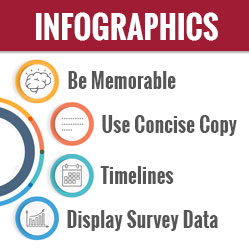
Eric: So first, how about we kind of take it back one step. You kind of jumped ahead of where we’re going here. So first off, just for our listeners out there, What is an infographic? I think we all kind of know. So, first off at its base level, it’s a visual image like a chart or a diagram used to represent information or data. Actually, the word comes from a blend of information and graphics. But I kind of did the Stamats take that I came up with was an infographic is a way to present information or data in a way that is memorable and also highly shareable.
So good infographics, I think, tell a story. It’s not just like throwing a bunch of information at somebody. You kind of want to guide people through your visual so it’s not just numbers on a page.
Mariah: When I’m looking at slides and things, and you just see walls and walls of text, paragraphs, lines. It’s so nice to have a visual, like a flow chart or something that illustrates it visually. You can just take it all in and kind of listen at the same time.
Eric: Yes, and that kind of brings up the point of when should you use an infographic, and then I promise we’ll get to that responsive infographic definition. So, infographics, the end goal here, you can kind of make complex information easier to digest.
You can kind of provide a general overview of the topic or event, or you can display research findings. If you have a survey or research you did, it’s a good way to kind of break that down so you’re not sharing a bunch of PowerPoint slides or something really complex in terms of numbers.
And also, an infographic can add to the story you’re telling. So, think of it as something you can add to a blog post or an article and not necessarily just repeat what you said in that article, but kind of just breaking out something that you really want to hone-in on.
Mariah: Groups like the New York Times do a really nice job of this when they have timelines or when they have breakout stats and things like that. It’s really nice to just have that poppy visual. Whether it’s static on the page or something that you have to download, it just adds another element to the story, like you said.
Eric: Yep. A brand that I work closely with, also powered by Stamats, is MeetingsToday, and an example of when we’ve used infographics, we do an annual trends survey. We display results that way for that. It’s almost moved fully to an infographic presentation.
And then we have destinations stories that kind of tie—we did a story on Puerto Rico and its comeback after Hurricane Maria, and all the new developments were broken down into an infographic. So, there’s a lot of ways to work the infographic into your story and tell a story.
So, that was a long-winded explanation, but to get back to the responsive infographic, to me, a responsive infographic is just an infographic that’s viewable across various devices. So, back in the day when you had infographics, you would think, ‘Oh, people are going to look at this on a desktop computer. It just needs to be a big enough visual so they can read it on that screen.’ But now when you see a lot of infographics, even to this day, you open—problem one, the copy is really small or it’s too much text. You try to read it…

Mariah: Pinch and scroll. Pinch and scroll.
Eric: Yeah. Even some amazingly to this day, you’ll see that you can’t even pinch and scroll. It’s just the tiny image static stuck on the page. So, the idea behind the responsive infographics and kind of our topic here today is creating better infographics, is that you make your infographic viewable across various devices.
So, if you wanted to display your cool research findings, whether it’s education research or something, you want to make sure you check the cell phone, you check the tablet view, and you keep that in mind because that’s going to be a large percent of your audience that’s going to be viewing infographics that way. And at a base level, you could make a responsive infographic kind of creating it like an article.
So, you could break your bigger infographic into chunks. That doesn’t really require as much development knowledge on the back end. And kind of the usual tricks for creating a responsive infographic, break up your data into pieces, like I said. New York Times does that a lot, and we mentioned…
Mariah: Separating it with paragraphs or sentences.
Eric: Yeah. And use bigger visuals and kind of less large text. Because if you are thinking of a more traditional infographic, then you don’t want to overwhelm people with the information and images because they’re just not going to be able to see it.
Mariah: One thing we use in a lot of our reporting is just a small horizontal infographic. It’s not digitally done or anything like that, so it works out nicely in print, social, and on digital, is just break out stats. One we talk about frequently is, “We had 90 health care clients in 2018,” or we could talk about, “We worked with X number of medical schools in 2018.” And it’s nice just to have that displayed instead of saying, ‘Here’s a long-winded paragraph about all these things we did.’ You can just pop it out as a nice visual.
Eric: Yep. So, yeah. I mean I guess that’s the responsive side of it. And today, we were also going to talk about interactive infographics, I think is the plan. So, interactive infographics for our purposes here is kind of a more complex infographic. It’s kind of taking your responsive infographic and going to the next level. So, this is more like your user could actually interact with it, or they could scroll and see various elements move on the page.
So, it’s almost using like Adobe Flash and different design software and tools to make a more engaging infographic. These are pretty labor and time intensive so unless you can bring somebody in to do this, or you really have a design team that you can work with and you think it’s a really big infographic that’s important to whatever goal you’re trying to get across, that’s kind of when you would want to use an interactive infographic.
So, these kind of require HTML, CSS, JavaScript—I won’t get into all the technical details, but that’s more where if you had a design team, or if you were looking to enlist looking up a third party to work with you, that’s kind of where you would get into interactive.
But at the base level, I think responsive can be used by everyone and created by a less experienced or knowledgeable design team.
Mariah: I’ve seen those before. You’ve mentioned those to us before here in the office, parallax design, where you can start at the top of the page and scroll down and the elements just kind of fly in at you. I’ve seen those across industries. And I’m not usually one for video and for busy kinds of pages. But it really is a nice way to deliver a story in segments when it’s very important for the user to see the first part and then the middle part and then the end part. It kind of prevents you from that normal user behavior—let’s scroll to the bottom and then back up—because it delivers what you need as you go down the journey of that page.
Eric: Yep. And that kind of ties back in to what I came up with, which was the Stamats take or at least the Eric take is, basically, good infographics tell stories. And I think interactive infographics, you really have a lot of opportunities to tell a story. Like you said, it kind of forces you to scroll through and pay attention while you’re scrolling, so you almost have a beginning, middle, and end. Whereas responsive, you’re still maybe going to have that instinct to scroll down, scroll back up and just kind of skim as you go. Which it depends on your purpose. Sometimes that’s all you really want somebody to do.
So I guess in summary on both those, there’s basically two types of modern infographics. You’ve got your interactive, you’ve got your responsive, and when dumbed down, you can kind of make an article, break your infographic into chunks, and it can be responsive, or a blog post, or whatever you’re doing. But true interactive infographics, as we mentioned, kind of require more web designing expertise.
Mariah: I would say, too, I think infographics are one of those mainstays that just continue to be fun and just continue to develop in content marketing and branding. Because really you have to get the whole team involved, you have to have good solid concise content that tells what you want the user to do or what you want them to walk away with. You have to have a beautiful design and our team here at Stamats does such a lovely job of really intuitively knowing what we’re saying: “Can you make us this pretty thing? Can you make it do this thing?”
And so, you also have to have that great ability to get it pumped out there, which is what you, Eric, and your team do for the digital strategy side of it, making it functional, making sure all those specs are there, and getting it out to the people in a relevant way where they are on social, on email, on the site, and so forth.
Eric: Yeah. I agree with all those points and, also, I had some takeaways that I think could be useful to people listening. So, just kind of recapping the facts that I had for making a case for better infographics, because that’s kind of what we’re doing here. Like I said, the worst nightmare is you share this big infographic and people can’t even zoom in on it on mobile.
Mariah: Too big to download! Oh no!
Eric: So, in terms of the case for better infographics, just to recap, a good infographic tells a story, it’s memorable and highly shareable. So, ideally, that means social media. That could even mean people just going old school and emailing an infographic, like, ‘Whoa, check out this cool…’ Sometimes email’s more engaging than social media, even, so, that’s still a win in my book. A good infographic should stand on its own and not just repeat information.
Mariah: Yes, absolutely.
Eric: And a great infographic, this is what separates you into the next tier, should be responsive and viewable across devices. So, I think that’s basically—what’s missing in a lot of infographics, even from reputable sites, I feel like I notice we’re not really there, and I think now it’s not so oversaturated, the market for infographics. I think they actually stand out more now if you do it right than they used to, maybe in the early 2000s when everybody was throwing around infographics it seemed like.
Mariah: Well, especially the ones that move and that do what you don’t expect or what you naturally expect, and then you’re surprised. So, you’ve always got to delight your audience. Absolutely.
So, if you’re interested in learning more about infographics, feel free to schedule some time with me, Mariah Obiedzinski, at Stamats. Hit us up—we’re happy to help you. And we appreciate your time today, Eric, sharing your expertise with us about infographics. Thanks for joining us.
Read this next: 3 Ways to Create Memorable Content According to a Neuroscientist
Ready to Get Started?
Reach out to us to talk about your strategy and goals.